TOPIC 11: STATISTICS ~ MATHEMATICS FORM 2
Statistics helps to present information using picture or illustration.
Illustration may be in the form of tables, diagrams, charts or graphs.
Display Information by pictograms
For example here is a pictograph showing how many apples were sold over 4 months at a local shop.
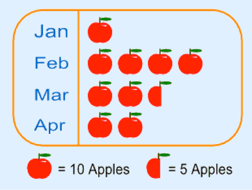
- The method is not very accurate. For example in our example we can’t show just 1 apple or 2 apples.
- Pictures should be of the same size and same distance apart. This helps easy comparison.
- The
scale depends on the amount of data you have. If the data is huge, then
one image can stand for large number like 100, 1000, 10 000 and so on.
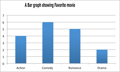
They are also called bar graphs. Is a graphical display of information using bars of different heights.
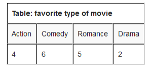
For example; imagine you just did a survey of your friends to find what kind of movie they liked best.
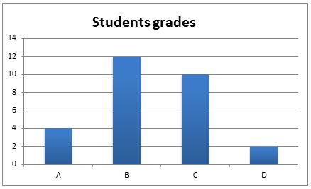
Interpretation of Bar Chat
Interpret bar chart
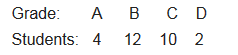
Scale: vertical scale: 1 cm represents 1 grade
These are graphs showing information that is connected in some way. For example change over time.
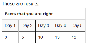
Example 1
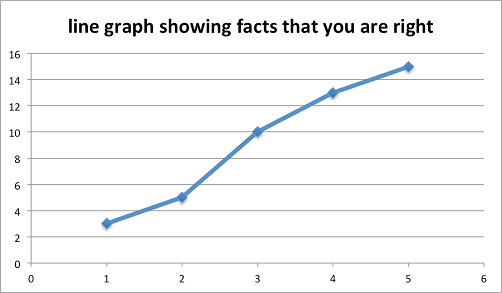
Interpretation of Line Graphs
Interpret line graphs
Example 2
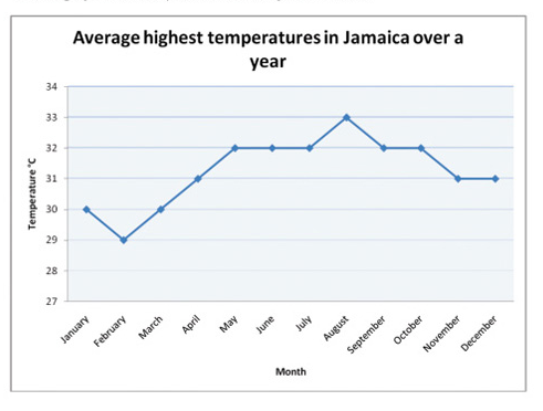
- The month that had the highest temperature was August.
- The month with the lowest temperature was February.
- The difference in temperature between February and may is (320-290)=30C.
- The total number of months that had temperature more than 300C was 9.
This is a special chart that uses “pie slices” to show relative size of data. It is also called Circle graph.
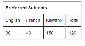
Example 3
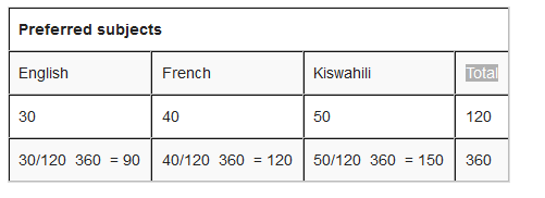
survey about pupils interests in subjects is as follows: 30 pupils
prefer English, 40 pupils refer French and 50 pupils prefer Kiswahili.
Show this information in a pie chart.
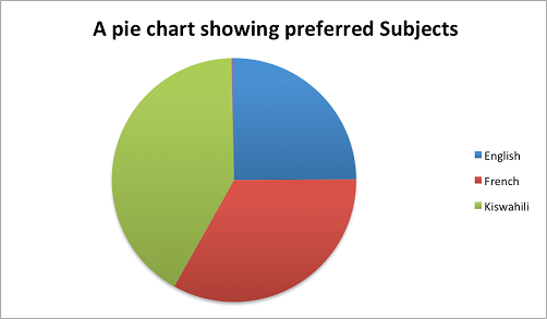
How to make them?
Step
2: divide each value by the total and then multiply by 360 degrees to
figure out how many degrees for each “pie slice” (we call pie slice a
sector) We multiply by 360 degrees because a full circle has a total of
360 degrees.
Step
3: draw a circle of a size that will be enough to show all information
required. Use a protractor to measure degrees of each sector. It will
look like the one here below:
Interpretation of Pie Charts
Interpret pie charts
Example 4
Interpreting the pie charts.
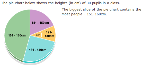
angle of this section is 36 degrees. The question says there are 30
pupils in the class. So the number of pupils of height 121 – 130 cm is:
Frequency
is how often something occurs. For example; Amina plays netball twice
on Monday, once on Tuesday and thrice on Wednesday. Twice, once and
thrice are frequencies.
•Write how often a certain number occurs. This is called tallying
- how often 1 occurs? (2 times)
- how often 2 occurs? (5 times)
- how often 3 occurs? (4 times)
- how often 4 occurs? (2 times)
- how often 5 occurs? (1 times)
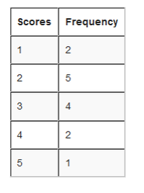
From the table we can see how many goals happen often, and how many goals they scored once and so on.
is very useful when the scores have many different values. For example;
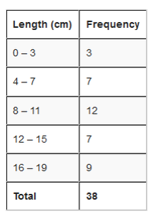
Alex measured the lengths of leaves on the Oak tree (to the nearest cm)
16, 13, 7, 8, 4, 18, 10, 17, 18, 9, 12, 5, 9, 9, 16, 1, 8, 17, 1, 10,
5, 9, 11, 15, 6, 14, 9, 1, 12, 5, 16, 4, 16, 8, 15, 14, 17.
Put the numbers in order. 1, 1, 1, 4, 4, 5, 5, 5, 6, 7, 8, 8, 8, 9, 9,
9, 9, 9, 9, 10, 10, 11, 12, 12, 13, 14, 14, 15, 15, 16, 16, 16, 16,
17, 17, 17, 18, 18,
Find the size of each group. Calculate an approximate size of the
group by dividing the range by how many groups you would like. then,
round that group size up to some simple value like 4 instead of 4.25
and so on.
that is less than or equal to the smallest value. Try to make it a
multiple of a group size if you can. In our case a start value of 0 make the most sense.
In
our case, starting at 0 and with a group size of 4 we get 0, 4, 8, 12,
16. Write down the groups. Include the end value of each group. (must
be less than the next group):
Upper and Lower values
Referring our example; even though Alex measured in whole numbers, the data is continuous.
For instance 3 cm means the actual value could have been any were
between 2.5 cm to 3.5 cm. Alex just rounded numbers to whole numbers.
And 0 means the actual value have been any where between -0.5 cm to 0.5
cm. but we can’t say length is negative. 3.5 cm is called upper real limit or upper boundary while –0.5 cm is called lower real limit or lower boundary. But since we don’t have negative length we will just use 0. So regarding our example the lower real limit is 0.
See an illustration below to differentiate between Real limits and limits.
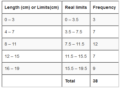
Class size is the difference between the upper real limit and lower real limit i.e. class size = upper real limit – lower real limit
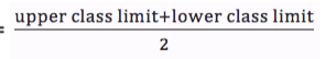
is a central (middle) value of a class interval. It is a value which is
half way between the class limits. It is sometimes called mid-point of a
class interval. Class mark is obtained by dividing the sum of the upper
and lower class limits by 2. i.e.
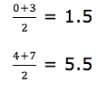
Class mark =
Interpretation of Frequency Distribution Tables
Interpret frequency distribution tables
Example 5
interpretation of frequency distribution data:
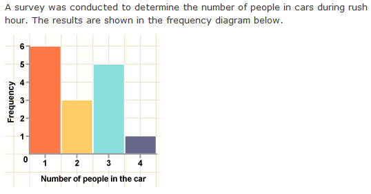
6 + 3 + 5 + 1 = 15
Cars
in the survey are most likely to have 1 person in them as this is the
tallest bar – 6 of the cars in the survey had one occupant.
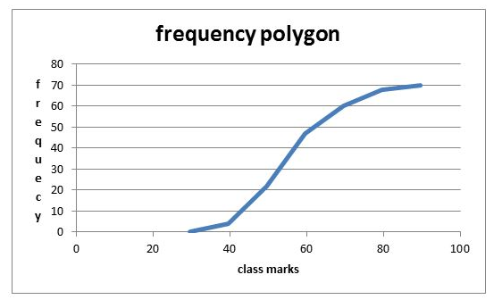
This is a graph made by joining the middle-top points of the columns of a frequency Histogram
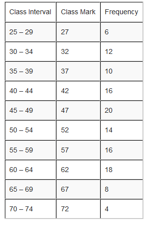
For example; use the frequency distribution table below to draw a frequency polygon.
In
a frequency polygon, one interval is added below the lowest interval
and another interval is added above the highest interval and they are
both assigned zero frequency.
The points showing the frequency of each
class mark are placed directly over the class marks of each class
interval. The points are then joined with straight lines.
Interpretation of Frequency Polygons
Interpret frequency polygons
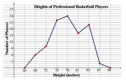
The frequency polygon below represents the heights, in inches, of a
group of professional basketball players. Use the frequency polygon to
answer the following questions:
Is a graphical display of data using bars of different heights. It is similar to bar charts, but a Histogram groups numbers into ranges (intervals). And you decide what range to use.
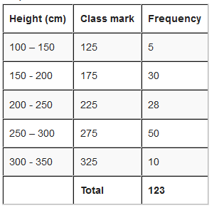
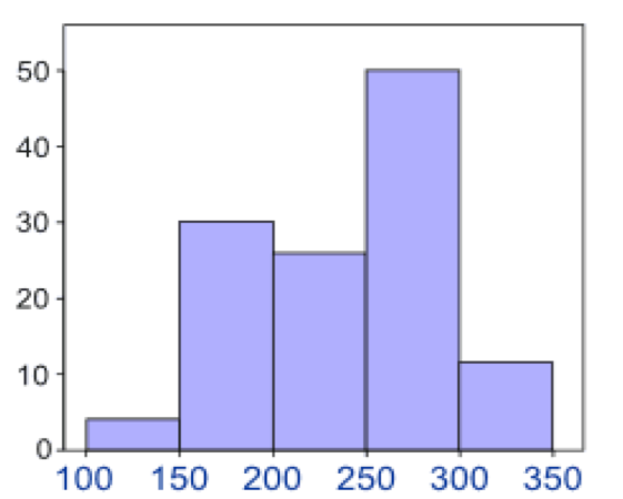
For
example; you measure the height of every tree in the orchard in
Centimeters (cm) and notice that, their height vary from 100 cm to 340
cm. And you decide to put the data into groups of 50 cm. the results
were like here below:
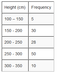
Represent the information above using a histogram.
In order to draw histogram we need to calculate class marks. We will use class marks against frequencies.
Interpretation of Histograms
Interpret histograms
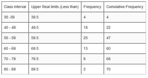
The histogram below represents scores achieved by 250 job applicants on a personality profile.
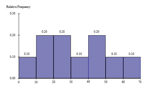
- Percentage of the job applicants scored between 30 and 40 is10%
- Percentage of the job applicants scored below 60 is90%
- Job applicants scored between 10 and 30 is100
Cumulative means “how much so far”. To get cumulative totals just add up as you go.
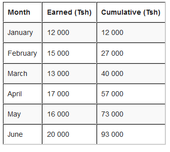
For example; Hamis has earned this much in the last 6 months.
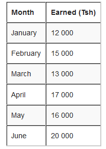
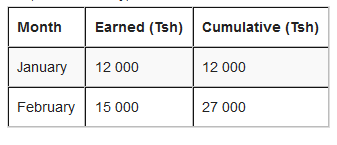
The first line is easy, the total earned so far is the same as Hamis earned that month.
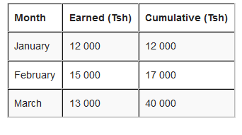
for
March, we continue to add up. The total earned so far is Tsh 12 000 +
Tsh 15 000 + Tsh 13 000 = 40 000 or simply take the cumulative of
February add that of March i.e. Tsh 27 000 + Tsh 13 000 = Tsh 40 000.
April: Tsh 40 000 + Tsh 17 000 = Tsh 57 000
The results on a cumulative frequency table will be as here below:
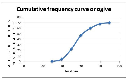
Graph for cumulative polygon is drawn with cumulative frequency on vertical axis and real upper limits on Horizontal axis.
Note: To draw an Orgive, plot the points vertically above the upper real limits of each interval and then join the points by a smooth curve. Add real limit to the lowest real limit and give it zero frequency.
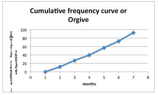
Interpret a cumulative frequency curve
Interpretation:
Exercise 1